


Care that grows with kids
COPA is where all kids receive the highest-level of specialty pediatric care from collaborative providers who are 100% dedicated to improving kids’ lifelong relationship with their health. They are also the #1 pediatric practice in Bend, Oregon. COPA came to us with a desire to take their brand to the next level.
OUR ROLE
Market Research
Content Strategy
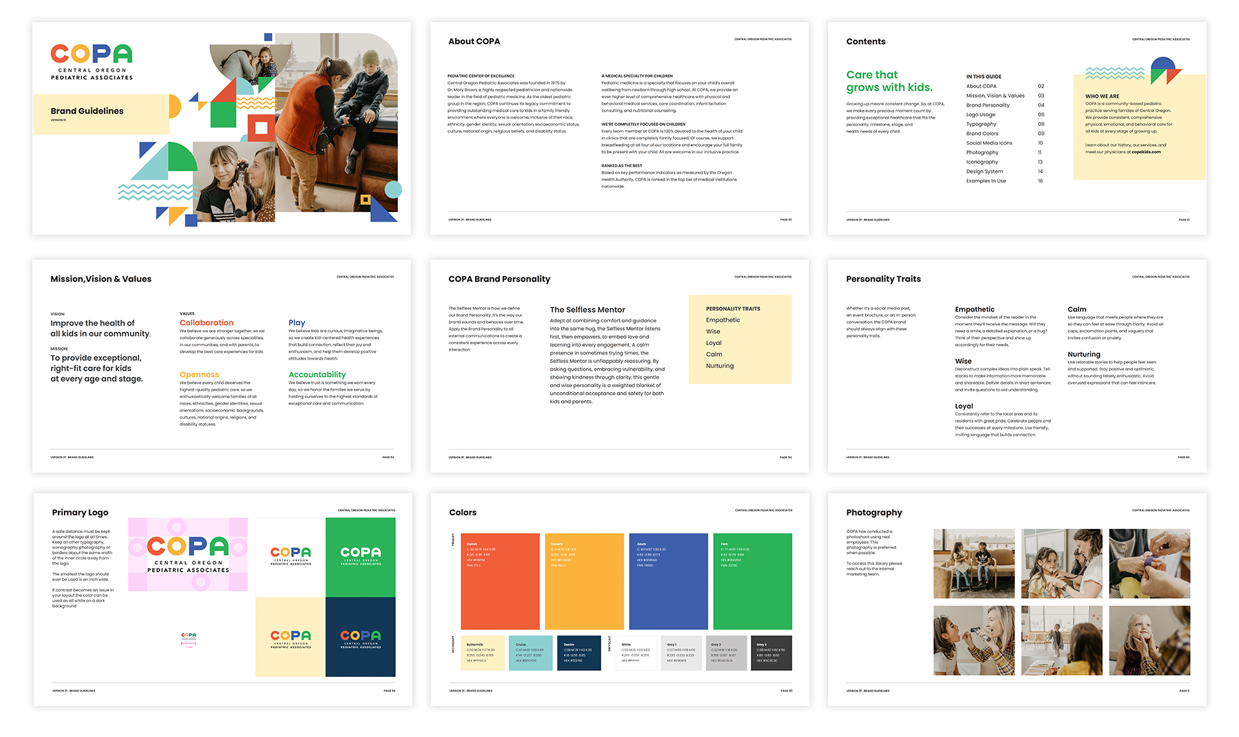
MIssion, Vision & Values
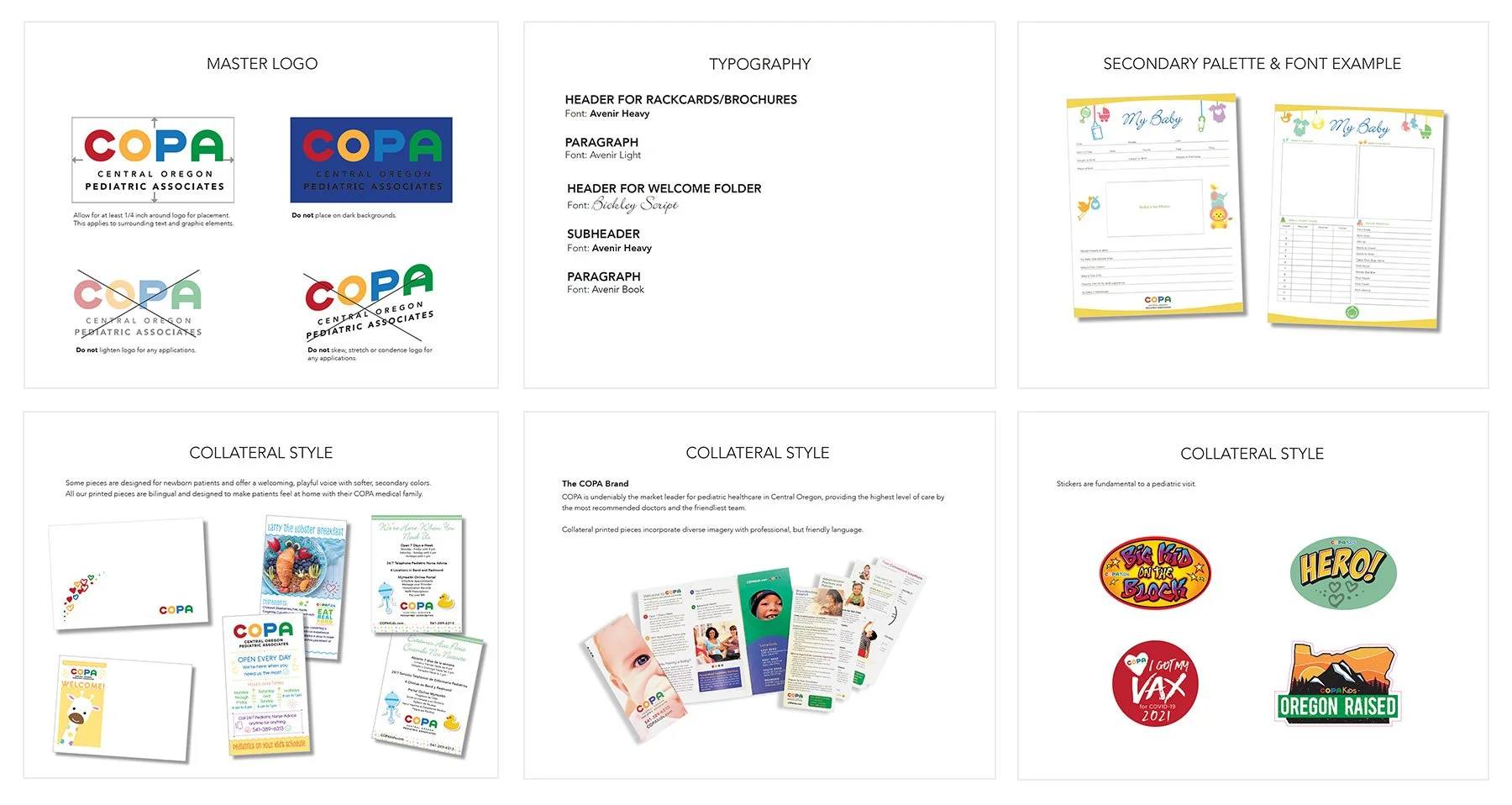
Brand Guidelines
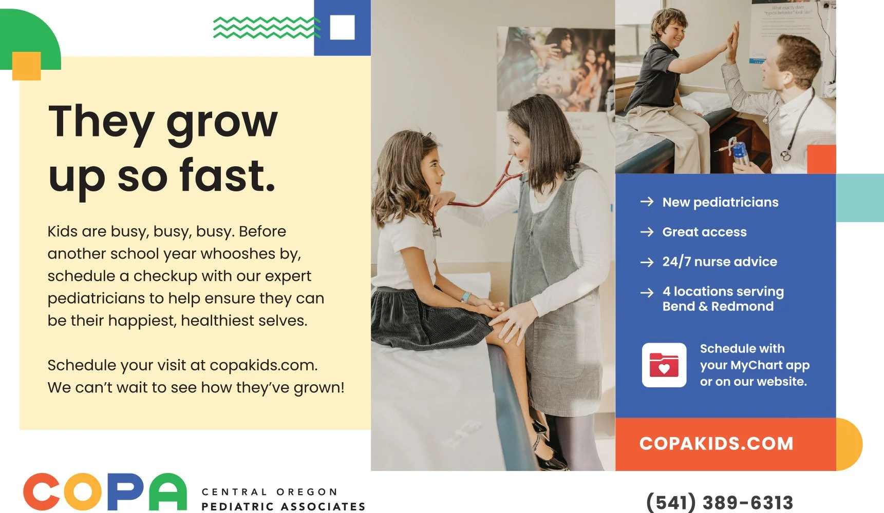
Advertising & Print Design
Copywriting
Event Graphics & Signage
In the beginning the COPA brand was inconsistent, lacked structure and overall did not feel professional.
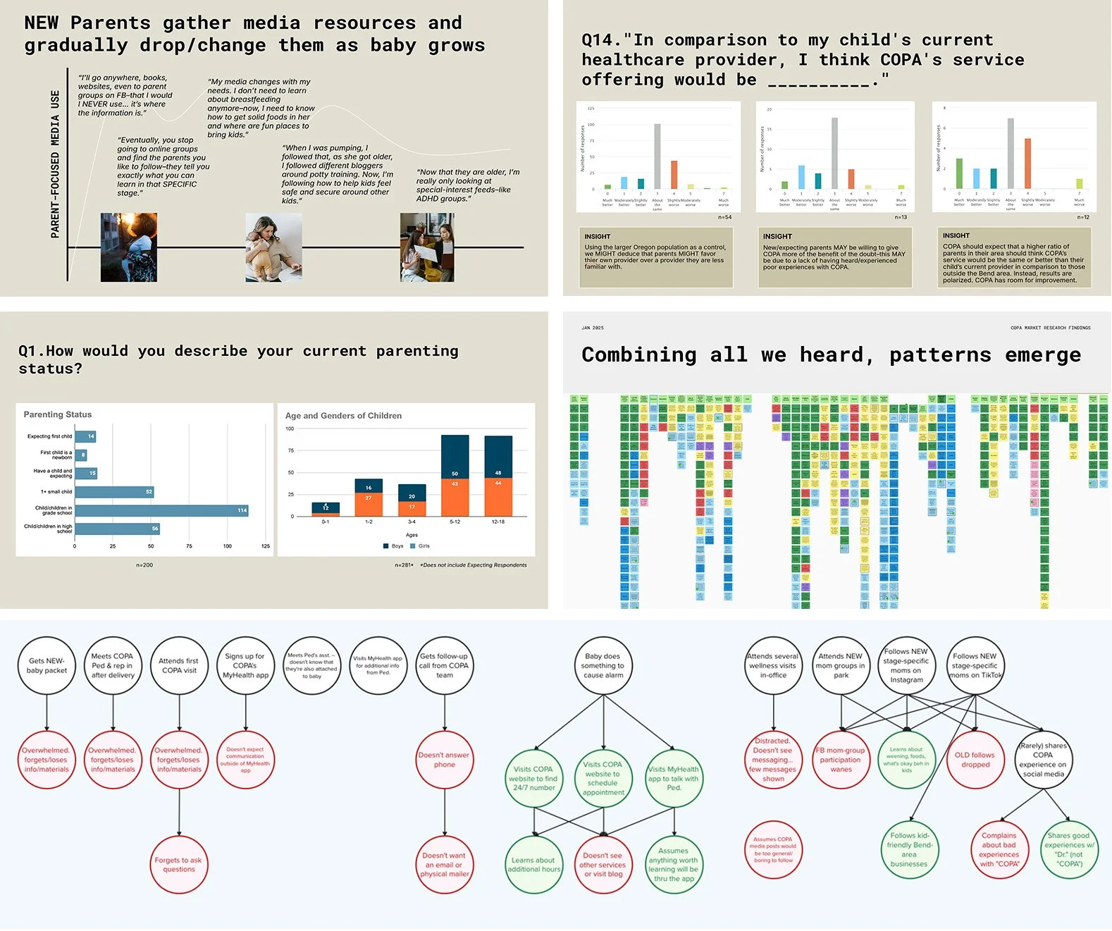
Starting with market research
COPA wanted to understand it’s market share and attract new patients, particularly young-first time parents with more kids. Our research aims to uncover decision making factors influencing parents choice of pediatric care here in Central Oregon. In order to understand the landscape better, Rover worked with a trusted research partner to conduct interviews with 11 experts, and 11 parents from inside and outside COPA. We uncovered six unique opportunities for the brand that we were able to incorporate directly into our work.
From this research, we were able to craft a core brand story that intersects the values of COPA as an organization with what new parents are looking for when shopping for pediatric care. A new set of brand guidelines were established containing updated Mission, Vision and Values for the organization. We established a brand personality that guides us on voice, tone and headlines for all our work.
Care that grows with kids
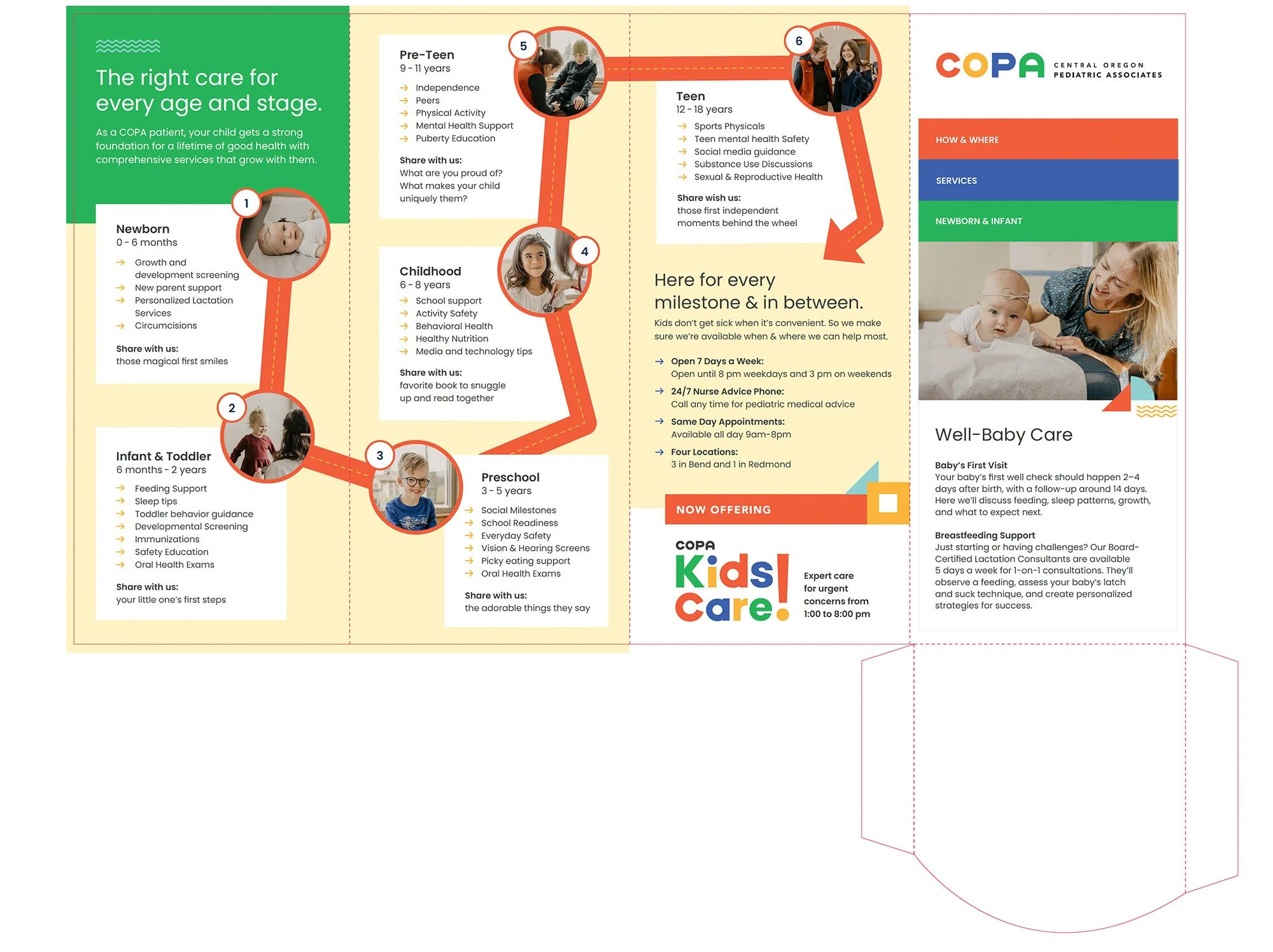
Creating a design system
We created a design system for COPA is based on the use of primary shapes. These layout elements add brand recognition, visual interest, and still feel child-like.
As a playful touch, we have added some mountain, river and trail shapes that symbolize the beauty of Central Oregon.
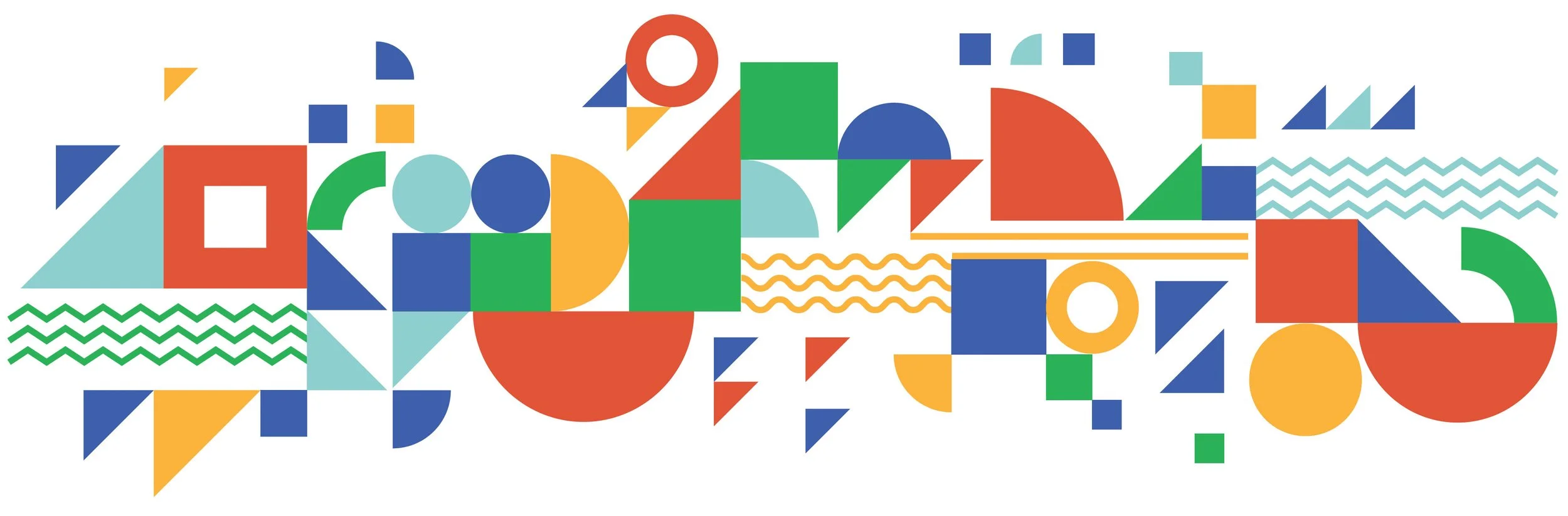
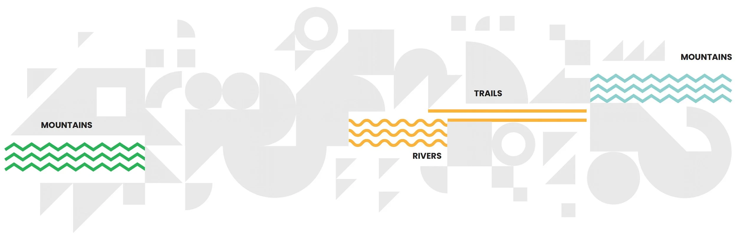
The shapes help establish a memorable brand for COPA across web, social and print materials

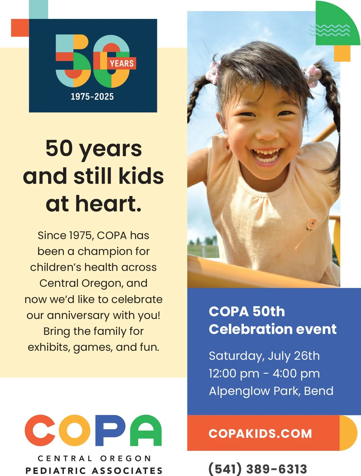

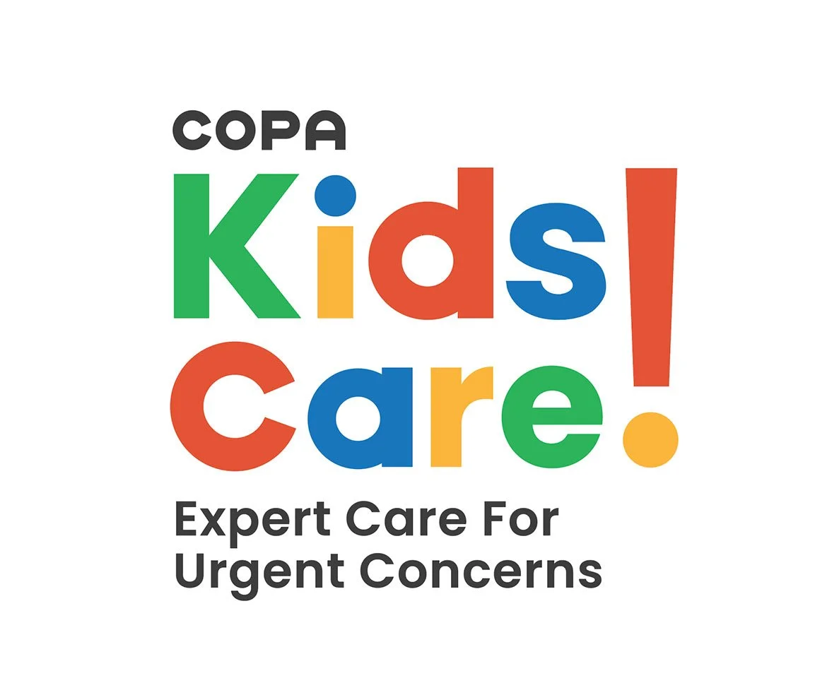
Excellence in sub branding
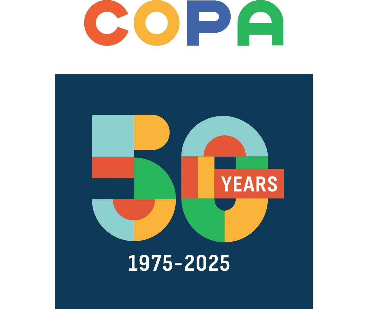
As the brand continues to expand we have had the pleasure of creating identities for Kids Care which has extended hours for parents with urgent needs. This year COPA is celebrating an aniversary. Congratulations on 50 years of excellence.
UP NEXT

Your health data just gained an edge. Master your health data instead of managing it, with the Data Management Platform designed exclusively for healthcare and life sciences.